User Experience Design Portfolio
UX Case Study
Mobile App UX & UI Design
RadioMv is a non-profit international Christian online radio station based in state of Washington. With more than a million listeners worldwide and 7.5 millions visits annually, this radio station grew from a garage based studio to worldwide broadcasting online in 5 languages. In 2015, they decided to design and develop a new mobile app in-house.
My Role
I managed this project from the beginning to the launch day. I had 2 interns that were assisting part time with administrative tasks, and a developer who wrote the code for iOS and Android. I designed the layout and UI for the app. I was the sole UX/UI designer for this project.
The Challenge
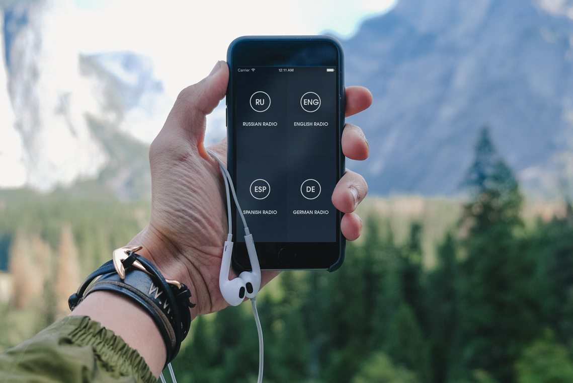
The radio station had an app in the app store before, but it became outdated and obsolete. It was missing the features that radio station wanted, and the app needed to be designed from scratch, rather than re-designed. At this point this was one of the 5 ways of listening to the radio station.
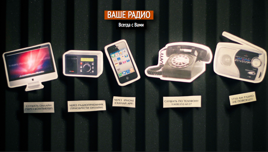
Ways to listen to the radiostation.
In addition to a brand new app, the radio station wanted to have both iOS and Android versions.
Discovery Phase
The project started by reviewing the current user and listener statistics, along with recently designed user personas, to determine the goals for the project.
Userbase Review
According to Google Analytics, about a quarter of visits to the website came from mobile devices, with age statistics all over the board. We knew we would have to design for a diverse audience.
Personas
The radio station is faith based and geared towards Christian families. That meant we needed to consider ages 13-65+. The following are a baseline for the radio station's user and listener personas.
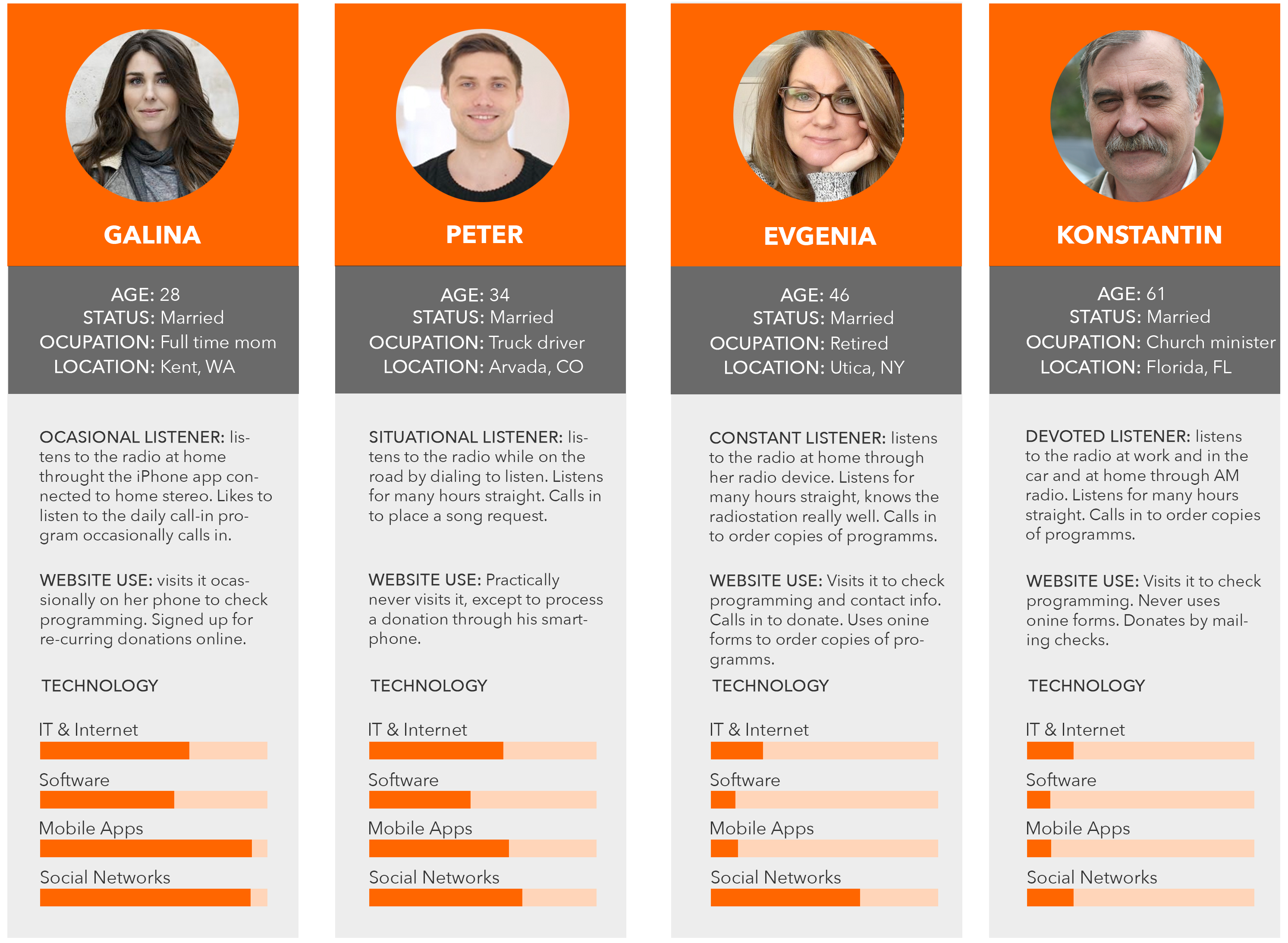
User Personas of RadioMv as of 2015
Review Takeaways
After reviewing our data, I knew that the app had to be simple and intuitive. The design would have to be simple enough for a child to navigate and versatile enough to accommodate 4 languages with 2 audio streams each.
The app needs to be available on both iOS and Android platforms, and in 4 languages”
In addition to that, the Russian language had an additional "Just Songs" channel with its own two sub channels.
Business Goals
- iOs and Android App
- Multiple streams in 4 languages
- Menu available during play session
- Donate button with full support
Design Goals
- Clean modern design
- Intuitive user choices
- Simple layout
DESIGN
The first step was to get a clear picture of how the user might go about the choices of language and audio quality. We couldn't really choose to launch the language based on location because our Russian listeners live all over the world. That meant we had to give them the option of choosing the language.
Information Architecture
I began with sketching various flow diagrams of how the users might interact with presented choices. Here is one version that I ended up using in the final design.
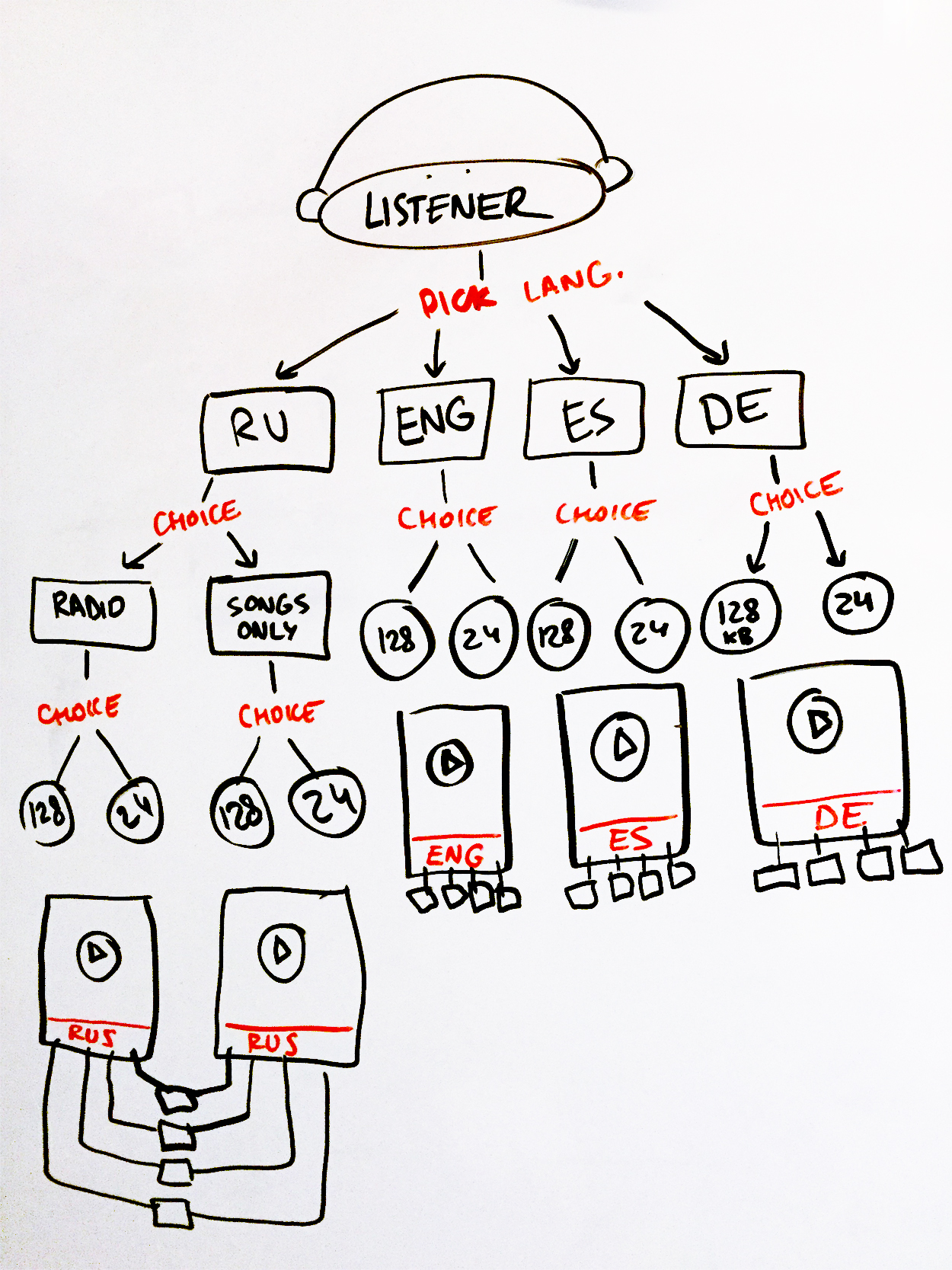
Flow diagram of the app choices.
After the "language and quality selection screen", the users would then arrive at the "play screen". There, they would be presented with play controls and a menu in the language of their previous choice.
That meant that there would be a total of 28 screens that would need to be designed.
Wireframes
Initially, I tried various approaches to the selection screens, including a drop-down menu.
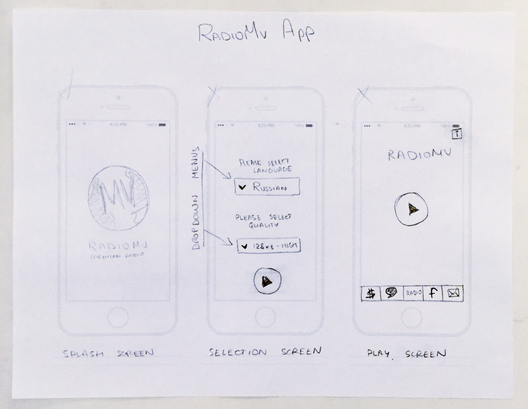
Initial sketches of the app.
After collaborating with the team, I came up with a design that was simple and logical, it took the user one step at a time, always giving a way back if they made a mistake or changed their mind.
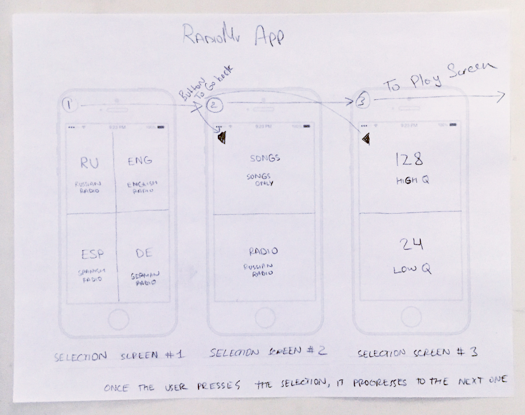
Final sketches of the app.
Once the user would select the final choice of audio quality, they would arrive at the "play screen" which would present the play/pause and volume controls along with 7 other buttons. The "play screen" would contain:
- "Play/Pause" button
- Volume slider
- Tiny "Go Back" button - top left corner
- Tiny "Info" button - top right corner
- "Support" tab - 1st option bottom menu
- "Chat" tab - 2nd option bottom menu
- "Radio" tab - active tab upon arrival, bottom menu
- "Social" tab - 4th option bottom menu
- "Contact" tab - 5th option bottom menu
UI Design
At this stage, I designed the buttons and labels for each of the screens. The dark gray theme matched the radio station's branding. The buttons are simple and the text is concise and to the point.
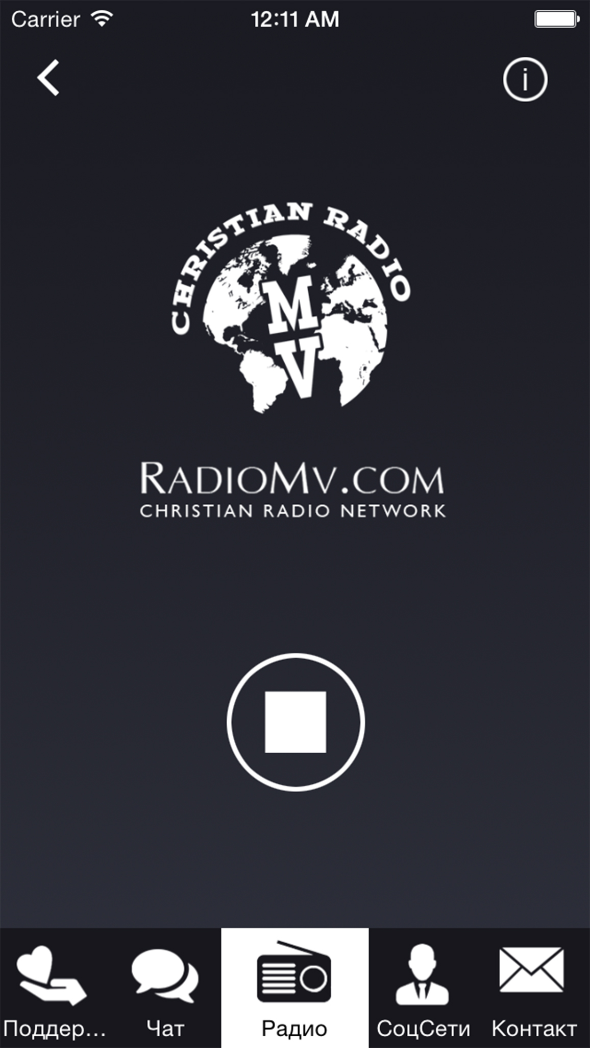
UI Design of the Play screen.
After finishing all the other screens, I had to prepare the graphics for the developer, slicing them separately.
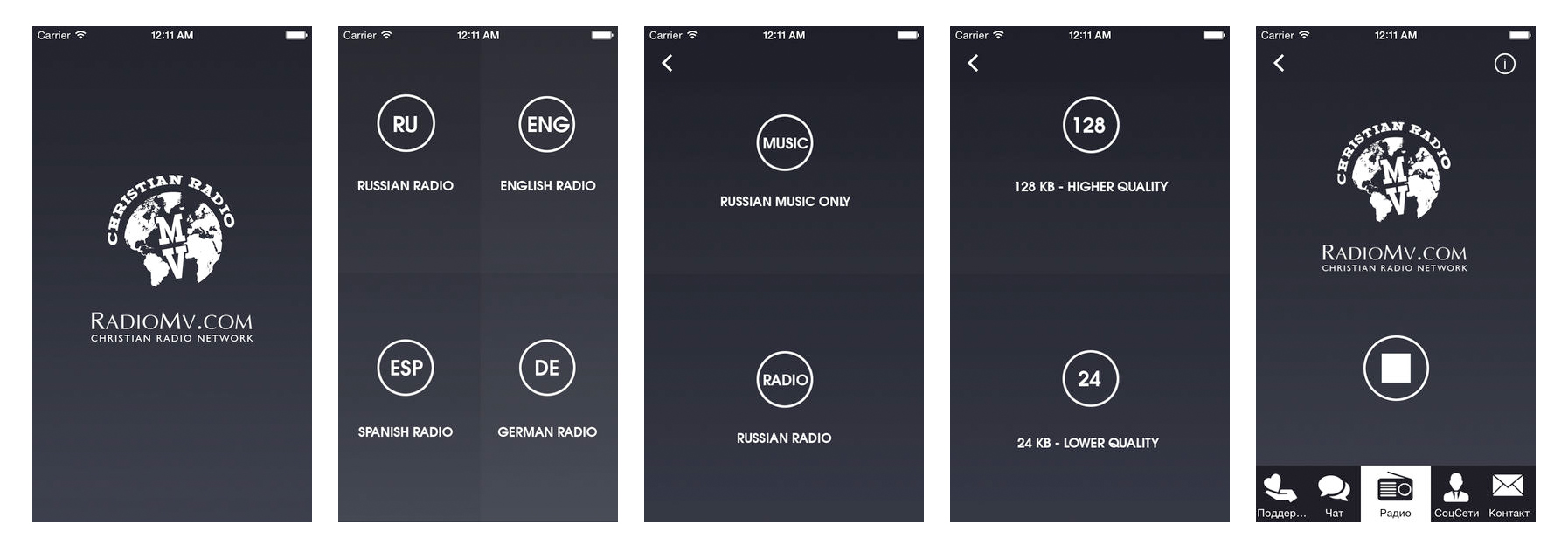
UI Design of the radio app.
At this point, I also designed the App icon for the iOS App Store as they require a whole set of sizes of the same icon.
Development
For this project I had a developer working under contract. He compiled the app for iOS and Android. Throughout the process, he would send me the builds and I would test them on my computer. I had loaded both Apple and Google SDKs on my machine.
Once the developer was done revising bugs that we would discover through our internal usability tests, he submitted the final builds to me. Then I was coached through the process of submitting the apps to their respective stores.
Google Play didn't take too long and the process was pretty easy, however with Apple things were different. It required a bit more time. Finally, the apps were approved and went live.
UX Success
Since its release the app has been used by listeners in multiple countries. Many use it on a daily basis.
As a result of the new app design, the radio station saw:
- Increased referral visits from the app to the website
- More mobile donations
- 14K downloads from Apple App Store
- 3.5K downloads from Google Play Store
Click here to check out the radio station app in the Apple App Store. Click here to check out the app in the Google Play store. Please keep in mind some aspects of the design might have been altered or changed over the years.
Website design and development by © Alex Gaidai 2020