User Experience Design Portfolio
UX Case Study
Healthcare Frontend Redesign
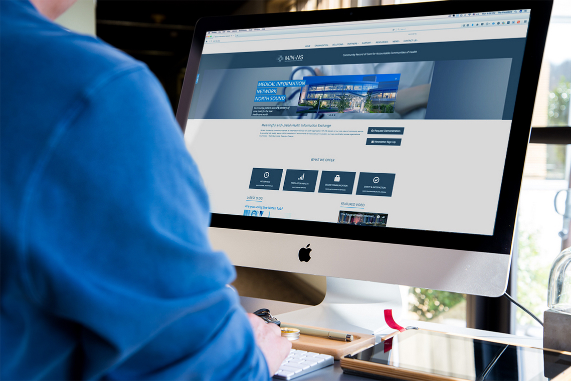
MIN-NS is a non-profit organization founded by the local hospitals of Skagit County. In 2015, they realized their website was in desperate need of an update. The current website was not presentable and did not reflect the organization’s growth.
My Role
I was tasked with the project of completely re-hauling the website to reflect the recently updated branding. Specifically, it was my job to:
- Manage the redesign project
- Conduct necessary research and propose a redesign plan
- Design a new user interface for the website
- Code a new template using Umbraco CMS
- Work with copywriters to edit and write new copy
- Launch the new website on time and on budget
The Challenge
It was unclear who the target audience was and the purpose that the website would serve. The original website was designed in 2011 and over time it became cluttered with content. Additionally it was running on an outdated version of Umbraco CMS.
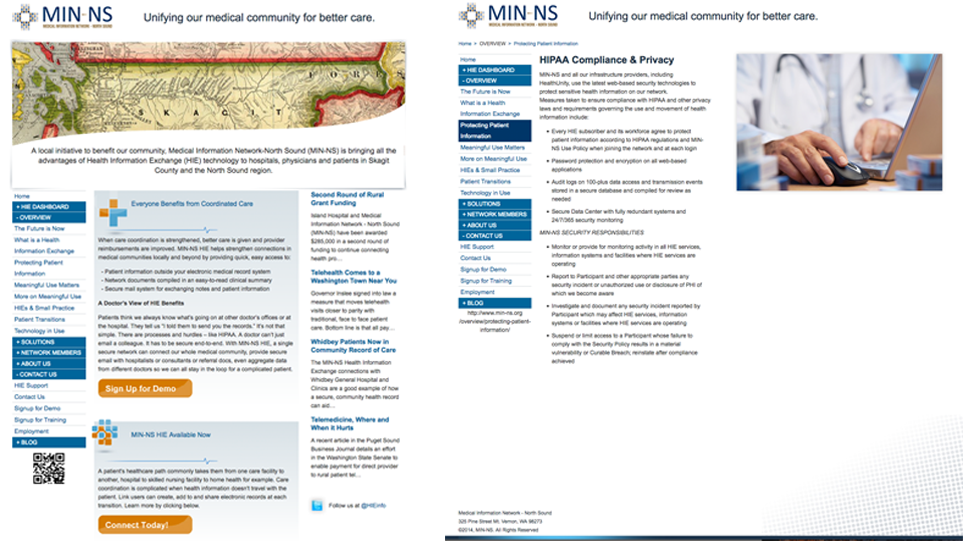
Screenshots of the old homepage and level two page.
Research
The first step was to determine the redesign goals. For that, I set out to review the existing website content, conduct stakeholder interviews and finally, conduct user interviews.
Heuristic Evaluation
To identify the immediately obvious design goals, I conducted a short, concise heuristic evaluation of the current design.
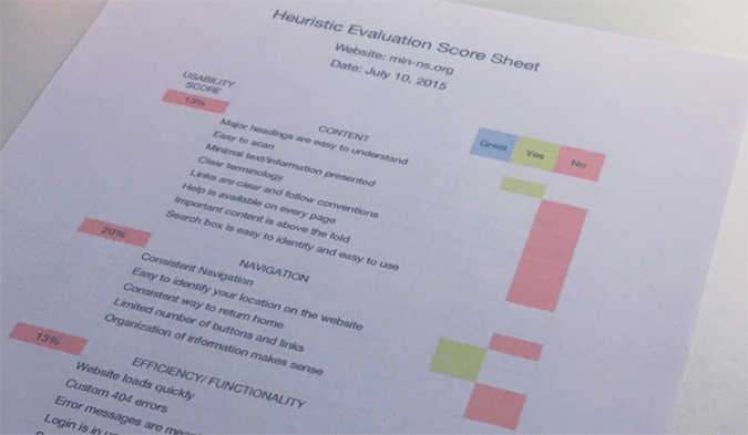
Heuristic evaluation of min-ns.org as of July 2015
The findings weren’t surprising, but they highlighted some of the main issues with the old design. Specifically:
- the information architecture and the navigation structure was confusing and inconsistent
- the design of the links was inconsistent
- the website was not mobile optimized
- the purpose of the organization was not clear
- visual design and a good portion of the content was outdated
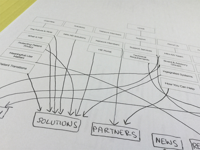
Content Inventory
To get a grasp of information architecture, I created a sitemap snapshot of current design. It was messy and lacked logical flow. I created a folder structure based on the sitemap and saved screenshots, text and graphical elements of each page.
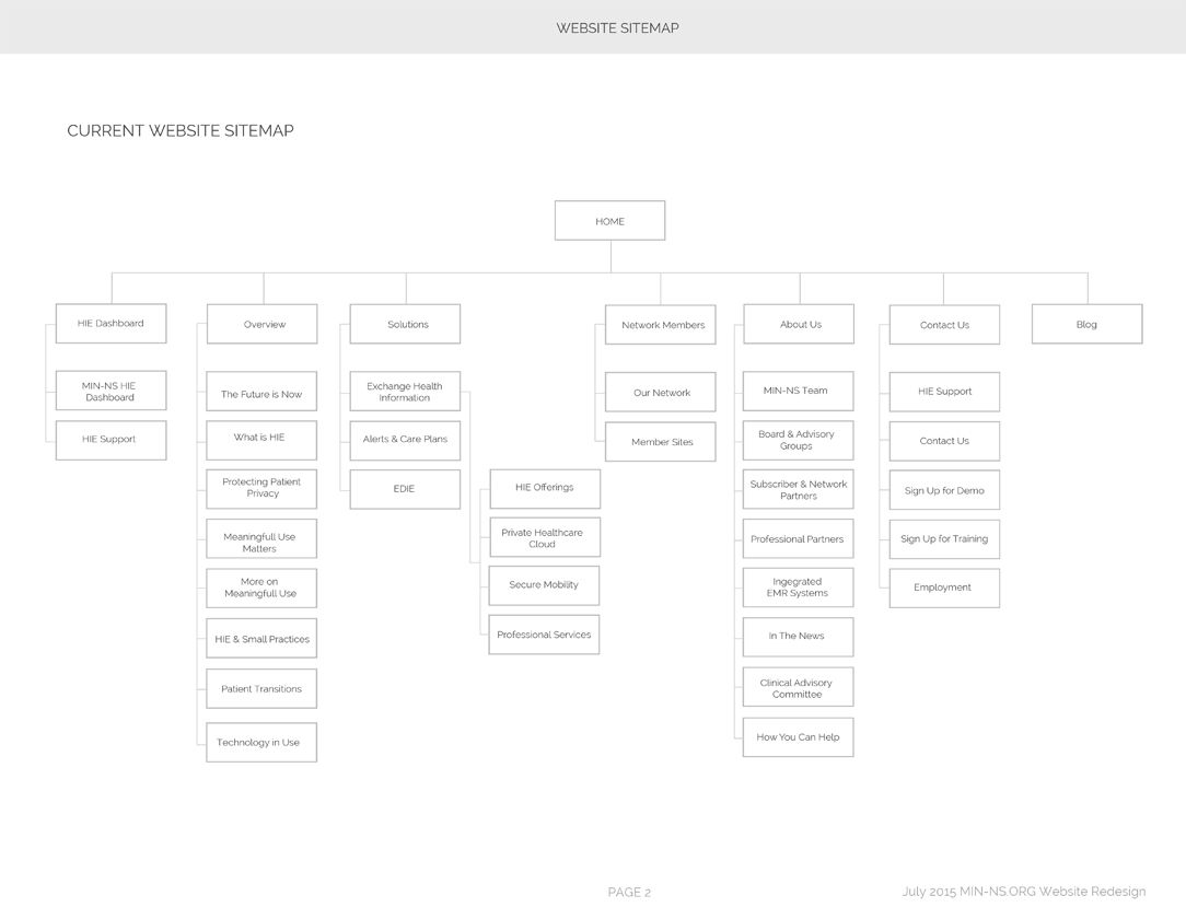
Sitemap of min-ns.org as of July, 2015
Industry Analysis
In order to gauge the current standards of the regional healthcare industry, I was directed to observe the founding hospitals' websites. MIN-NS being an innovative company had few comparable businesses in the US, and the ones that did were in just as much trouble with their lack of good design. I collected the highlights of this research and presented it as part of the design proposal to the executive team.
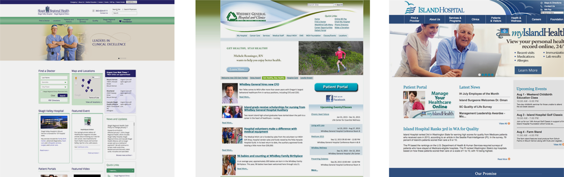
Screenshots of skagitregionalhelath.org, whidbeygen.org and islandhospital.org as of July 2015
User Research
Based on the previous data logs, content analysis and some interviews, I was able to define four types of users and their main reasons for visiting:
- Partners (stakeholders interest)
- Current Network Members (looking for help and more info)
- Prospective Network Members (information to join)
- State Officials (compliance, information)
- Local Citizens (information)
This clarified that there were two primary goals for the website - offer structured access to information on what MIN-NS does and facilitate user help support to network participants.
Stakeholders Interview
Meeting with the members of the executive team helped with clarifying questions about the organization's background, services provided, target audience, and business goals for the project and company. Following that, I presented my findings to them and we agreed on the business and design goals. For future development reasons, working with WordPress CMS was not approved.
Do whatever you got to do, but do it in Umbraco."
Working with Umbraco would be a challenge, I was used to working with WordPress and PHP. Umbraco was .NET based with Razor C# syntax. However, I was given plenty of time to study the new environment during the development phase.
Business Goals
- New professional theme reflecting the organization’s progress
- Trustworthy and credible tone
- Updated and revised content
- Accessible website design
Design Goals
- Reorganize content with unified voice and style
- Design a consistent and logical navigation structure
- Design quick access to the help section
- Design a responsive, mobile optimized website
- Position access to primary tasks from the home page
Design
Now that the goals were clear and agreed upon, I began working on decluttering the original website, making sense of the menu structure and flushing out possible UI layouts.
Information Architecture
At this stage, I enlisted the help of the organization's employees to sort out between what stays, what goes and what needs to be updated.
Working on defining top level menu categories.
As a result, a new sitemap was proposed. Upon further iterations, sections 2.4.1 to 2.4.3 were consolidated into 2.4, the sitemap hierarchy was reduced down to two levels.
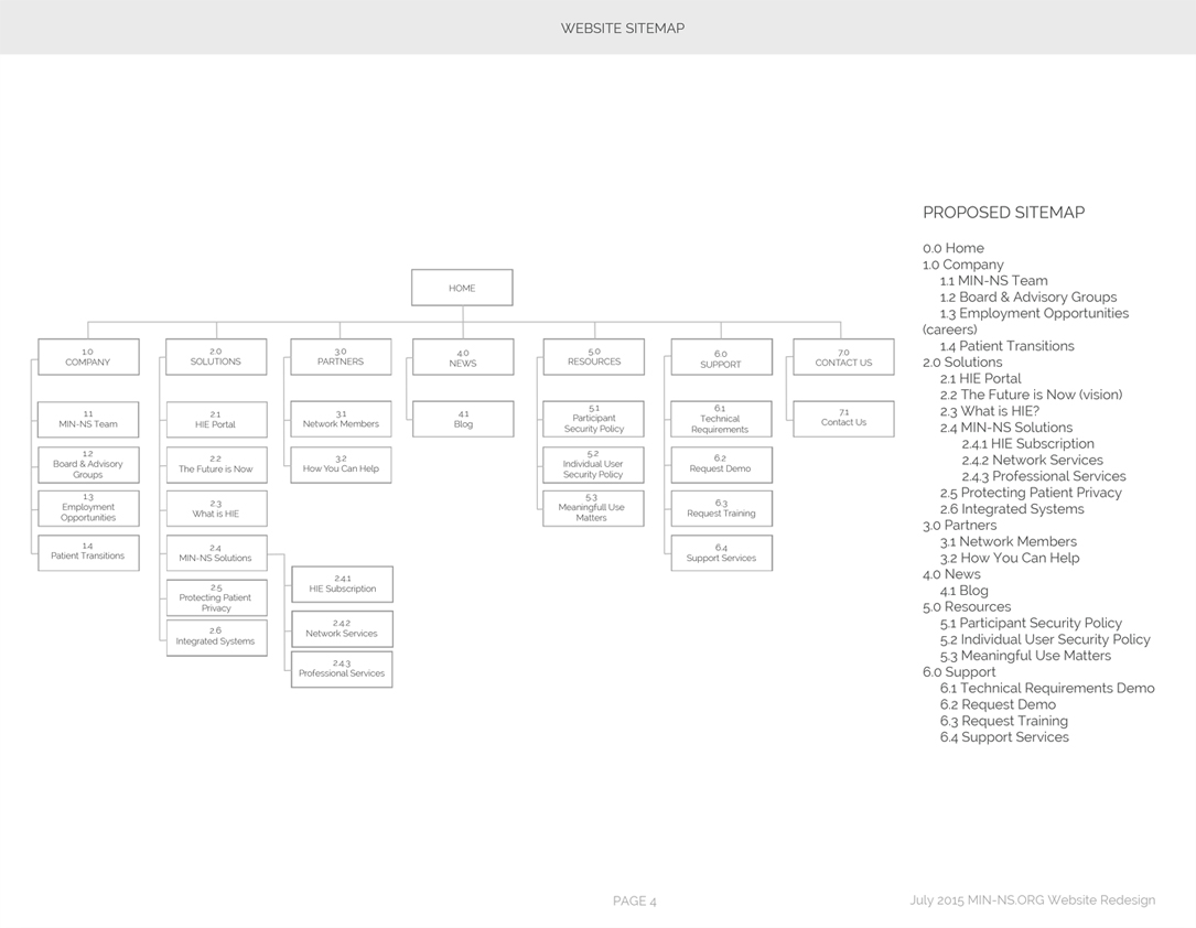
Proposed sitemap for min-ns.org redesign
That brought the project one step closer to making the content more accessible in fewer steps. Through this I reduced the time a user spends looking for information thus giving them more time to focus on the content.
Wireframes
Taking into account all the information gathered in the research and initial design stages, I began sketching a few different layouts for the home page and a few others.
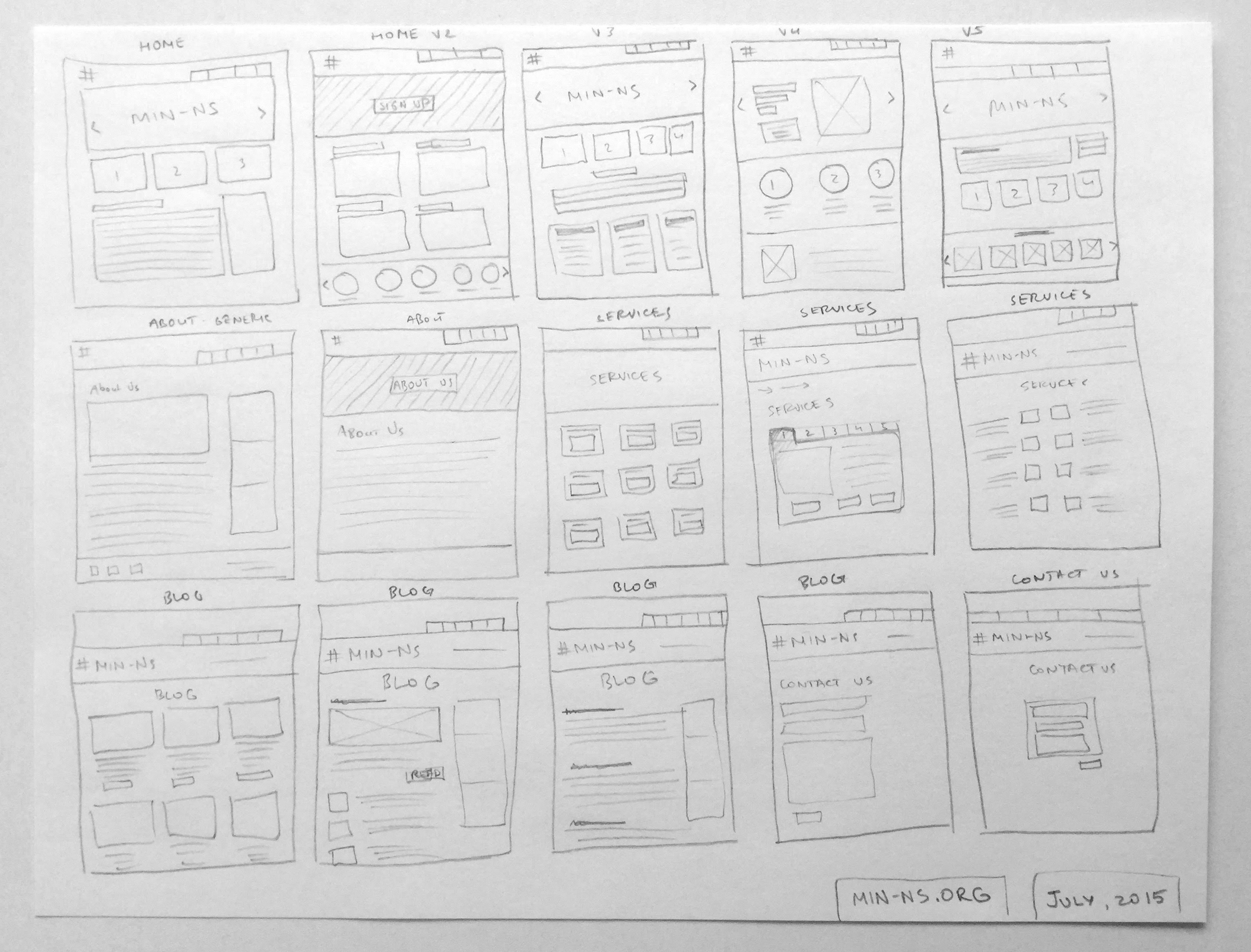
Wireframes sketches of page layout for min-ns.org
Following that, expanded sketches were made in preparation for a more detailed wireframe. At this stage, I chose the layout that would match business and design goals to position the primary user's tasks at the top of the home page.
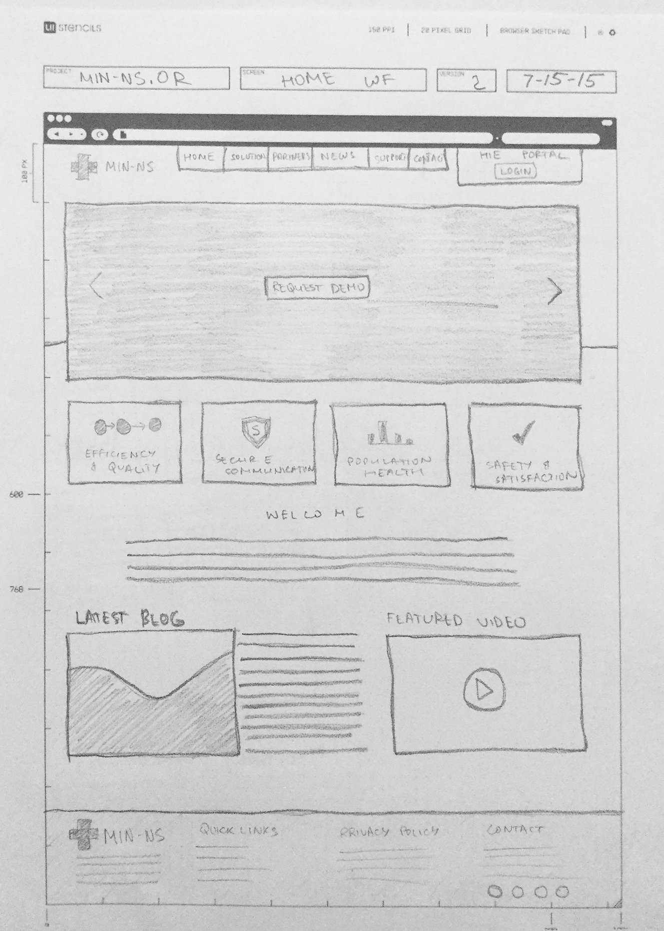
Expanded wireframe sketch of home page
Finally wireframes were created with more attention to the details of the layout. These were prepared to be presented to the executive team for review.
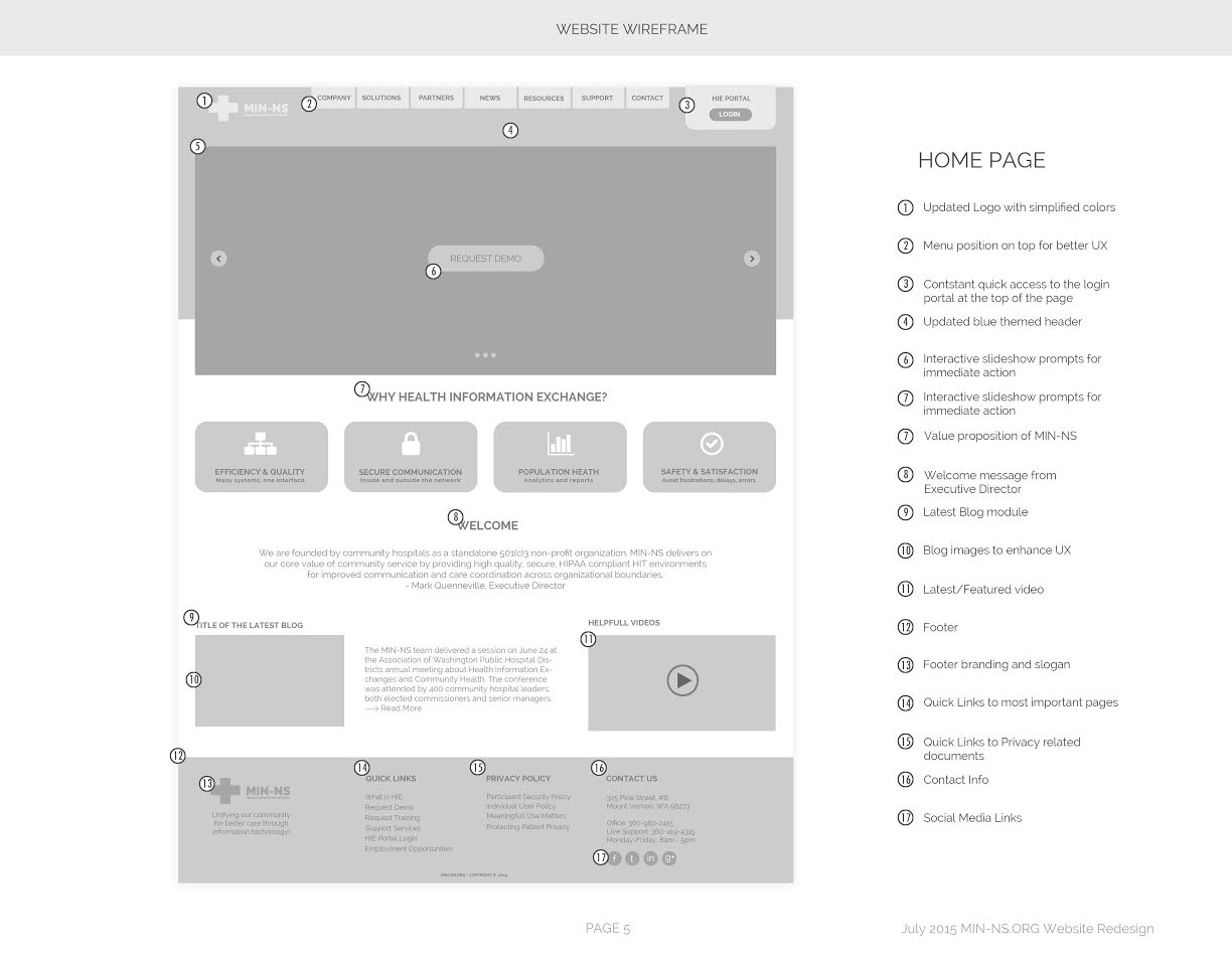
Expanded wireframe sketch of the home page
This wireframe of the home page presented new solutions which would be crucial in achieving the goals set for the project:
- Menu relocation to a more natural place at the top
- Login into HIE Portal is now available at the top
- New interactive slideshow added
- Value proposition follows the slideshow immediately
- Latest media and content is featured
- Footer has been designed for quick access to most visited pages
- And more...
UI Elements Design
The decision was made to go with Mariner tone of blue to convey professionalism and trust, along with contrasting dark gray. The following colors became the foundation for the design.
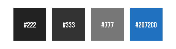
MIN-NS color scheme.
At this point I set out to design the specific UI elements pertaining to the look and style of the website. I also kept in mind the dimensions and behavior of each element as I would also be the one coding it in place.
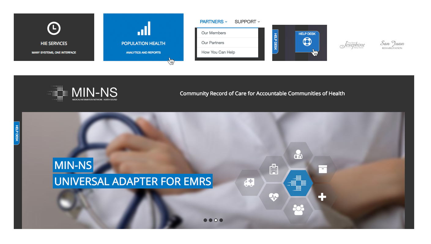
MIN-NS UI Elements
Development
After conquering enough ASP.NET/C# and Razor I began writing the template for the website, setting up all the pages and making sure they're all dynamic and editable.
Then came lots of hours of CSS, JavaScript, jQuery and hours of testing, reiterating, and so on.
Finally when the website was ready, the responsive design based on Bootstrap was tested on multiple devices. Error pages in place, menus linked, content filled - it was time to launch it!
UX Success
After the public launch of the website, we began receiving feedback from our users and stakeholders. We used that feedback to pivot the design as necessary. Overall, the organization saw:
- Increased engagement with the website
- Increased newsletter signups
- Positive reviews and great reception of the new design
- Much faster process for the writing team to upload content
- Decreased amount of web related tech support calls
Click here to check out the website. Please keep in mind some aspects of the design might have been altered or changed over the years.