User Experience Design Portfolio
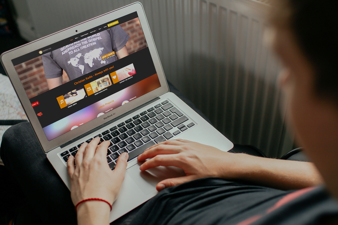
Short UX Case Study
Radio Station Front-end Redesign
RadioMv is a non-profit international Christian online radio station based in state of Washington. With more than a million listeners worldwide and 7.5 millions visits annually, this radio station grew from a garage based studio to worldwide broadcasting online in 5 languages. In 2015, they decided to redesign their website.
My Role
I managed the redesign project from the first briefing to the last post-launch analytics report. I did have 2 interns that were assisting part time on this project, along with a copywriter and 3 content translators. As outlined below, I redesigned the information architecture and migrated the updated content into a new CMS with new theme. I was the sole UX/UI designer for this project.
The Challenge
The last website redesign was in 2009 and since then it has been running on a sketchy, outdated version of Joomla. The number of website visitors grew significantly every quarter and the website performance was dropping. The radio station wanted a visual update of the website with migration to a more versatile WordPress CMS.
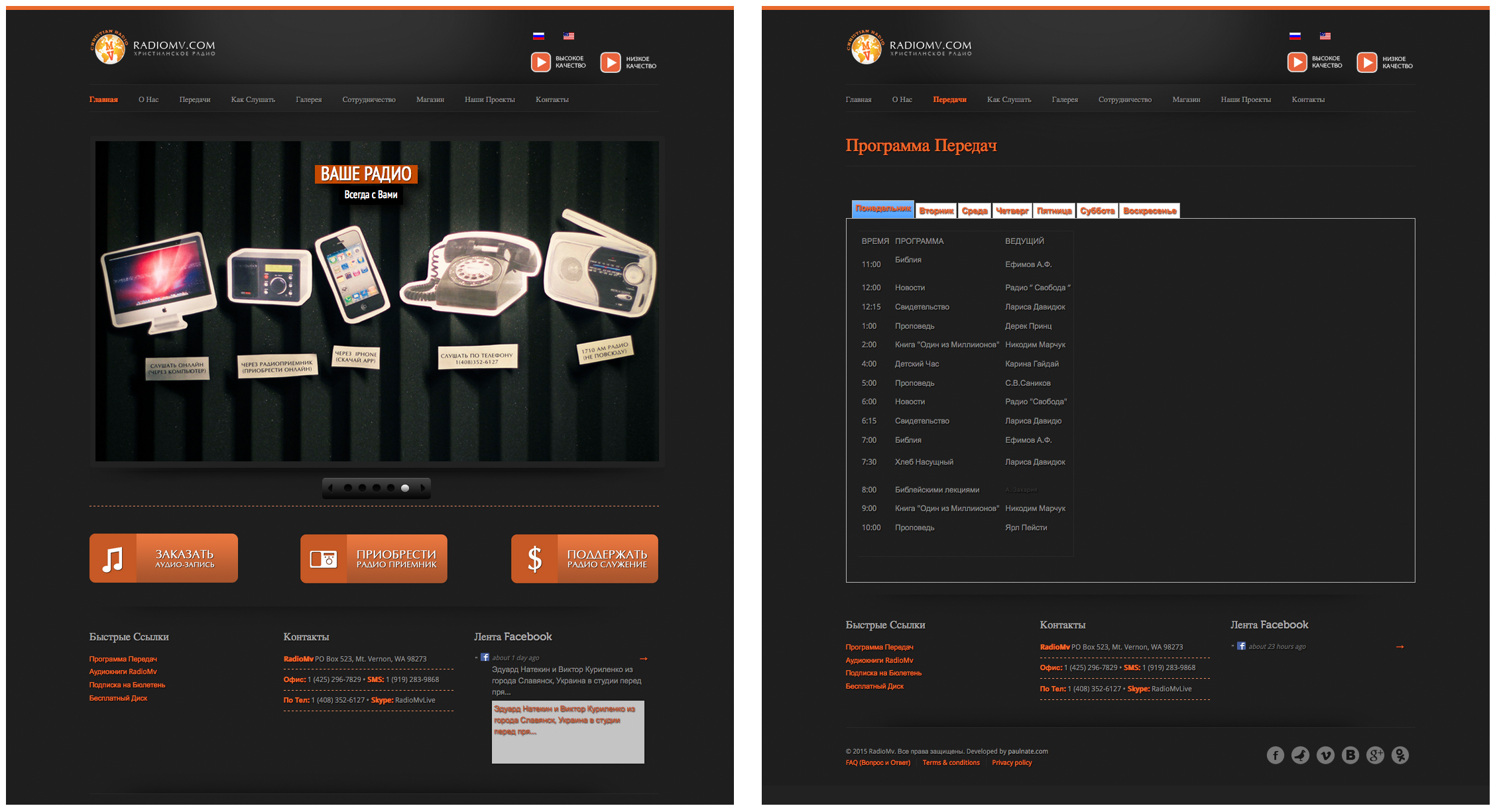
Screenshots of the old homepage and level two page as of 2013.
Discovery Phase
The project started by reviewing the current user and listener statistics, along with recently designed user personas, to determine the goals for the project.
Userbase Review
We pulled up Google analytics along with our customer database to determine who made up the bulk of our users. We also considered data from the letters and calls that were received within the year.
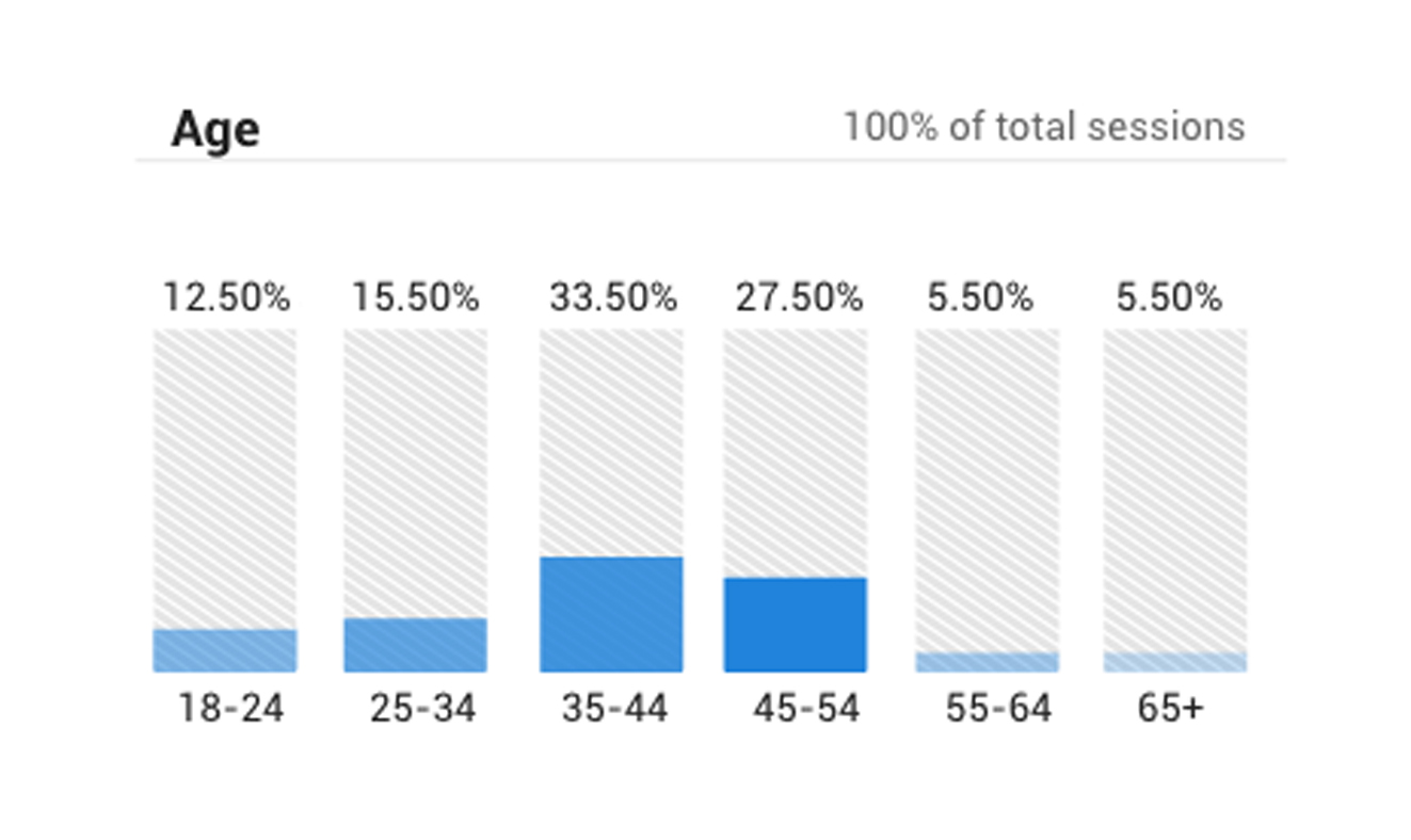
User Age Demographics as of 2015
Personas
Since the radio station is faith based, the listeners are diverse in age and experience with technology. The following are a baseline for radio station's user and listener personas.
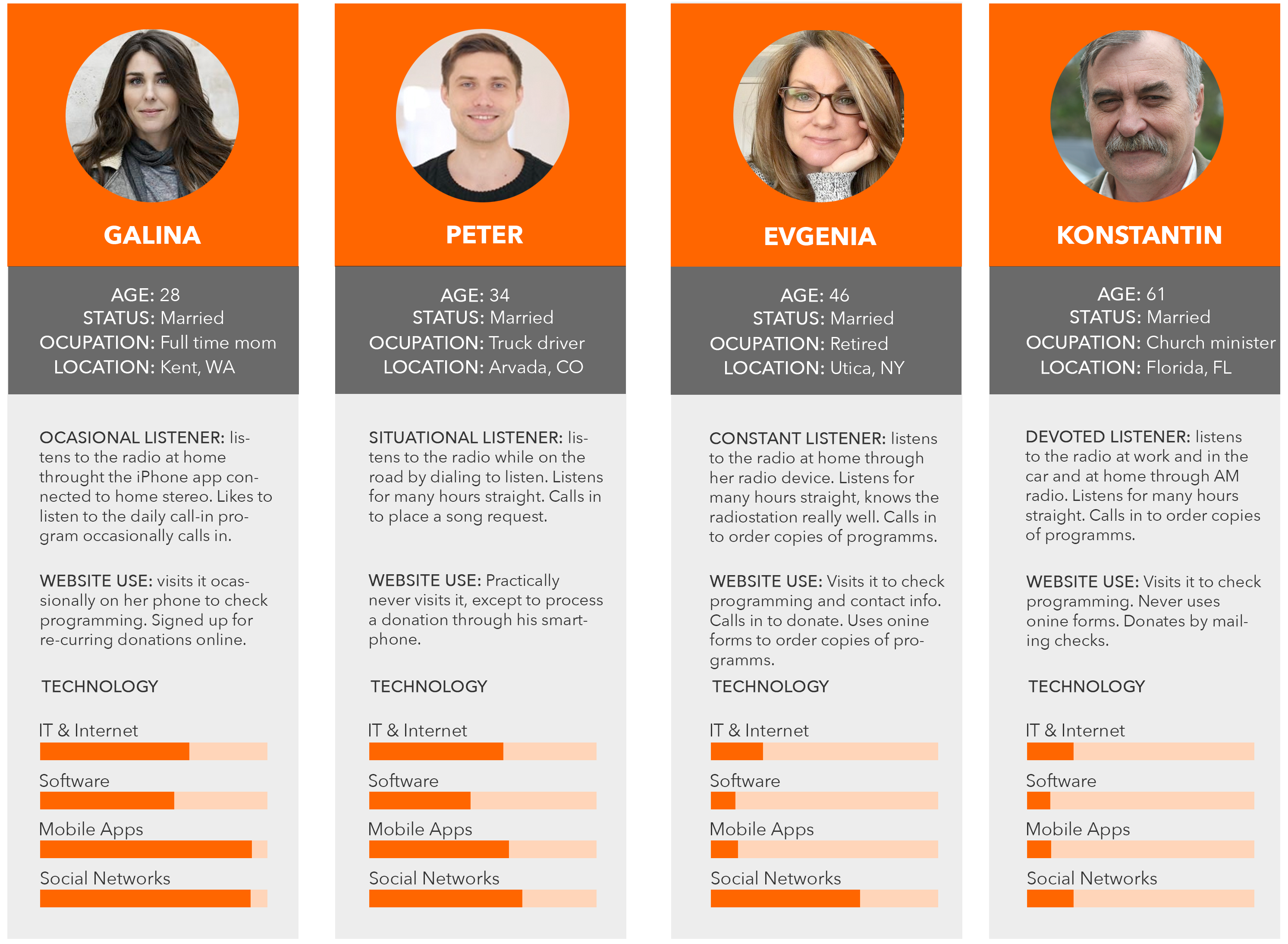
User Personas of RadioMv as of 2014
Review Takeaways
After reviewing the data and talking with the team and the director, we realized that one of the main reasons why the radio station wanted to update the website was aesthetics and security. As the online orders were increasing in frequency, they wanted to ensure that the website was running on a trusted CMS platform with the right plugins in place. Of course there were other concerns such as inconsistent design, lack images, poorly setup forms.
As we expand into Germany and Mexico, we need to accommodate multilingual access to the website”
That would mean that all the content would have to be reproduced in all four languages: Russian, English, Spanish and German.
The following business and design goals were set based on what the user personas and leadership vision for the project.
Business Goals
- Secure and robust development
- Multilingual support
- Platform setup for future growth
- New section to highlight projects
Design Goals
- New modern theme
- Quick access to most visited pages
- More content on the home page
- Better navigation structure
Design
The first step was to review the content. Even though the majority of the content would remain the same, I wanted to take the opportunity to revise and update as much as possible. A separate spreadsheet was created to keep track of changes.
Information Architecture
Once it was clear which content stays, I put together a few sitemaps until the team settled on the one below. It distributed all the pages under their logical categories. A new section titled "Our Projects" was added.
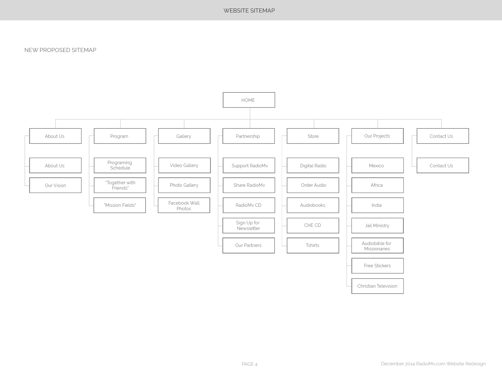
New Sitemap designed for RadioMv.
The proposed sitemap was then duplicated in the next three languages and I assigned translators to work on the copy for each.
Wireframes
From the beginning we knew that the budget and scope of the project would require us to use a commercial WordPress theme for this project. The CMS of choice was WordPress. After the board selected a WordPress theme there was not much room for UI design. However, there were plenty of options for layout.
I designed quick, rough wireframes of where we should position certain elements. I did the same for all the six types of pages. Below is one such wireframe for the homepage.
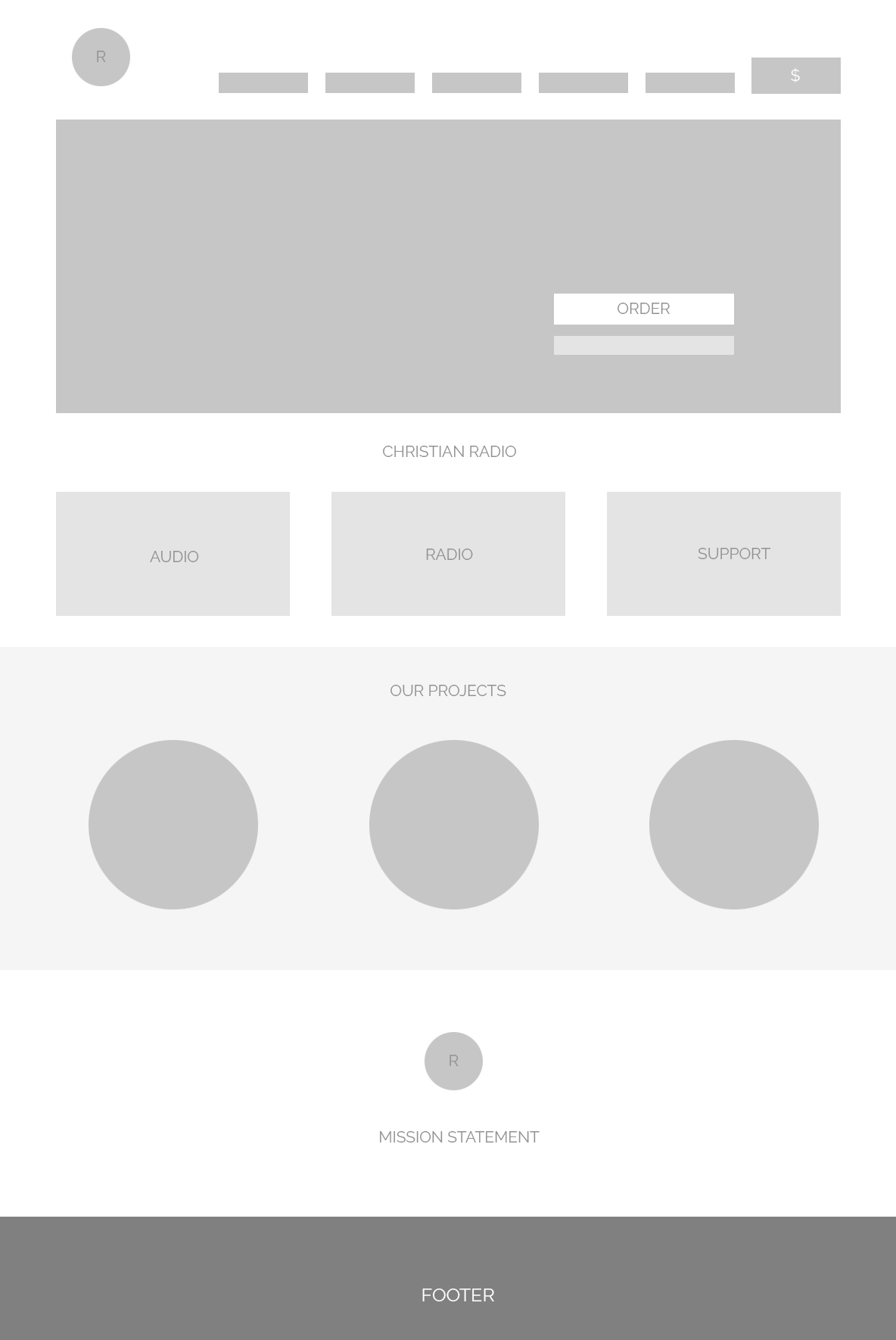
Rough wireframe of the home page.
Development
Working with WordPress was pretty straightforward. The theme that I had to work with was "Betheme" by Muffin Group. It's multipurpose, easy to use with hundreds of shortcodes and plenty of layout options.
What was challenging is figuring out a way to have the content in four languages. That meant that for each page there was 3 other pages that were exactly the same but in another language. To solve this problem, I used the "Multilanguage" plugin by BestWebSoft.
Other features such as automatic backup, captcha on all forms and multiple layers of security were added in WordPress backend.
UX Success
Finally, the website was launched. The number of visitors continued to grow. Facebook polls and calls from our listeners provided plenty of feedback on the new design.
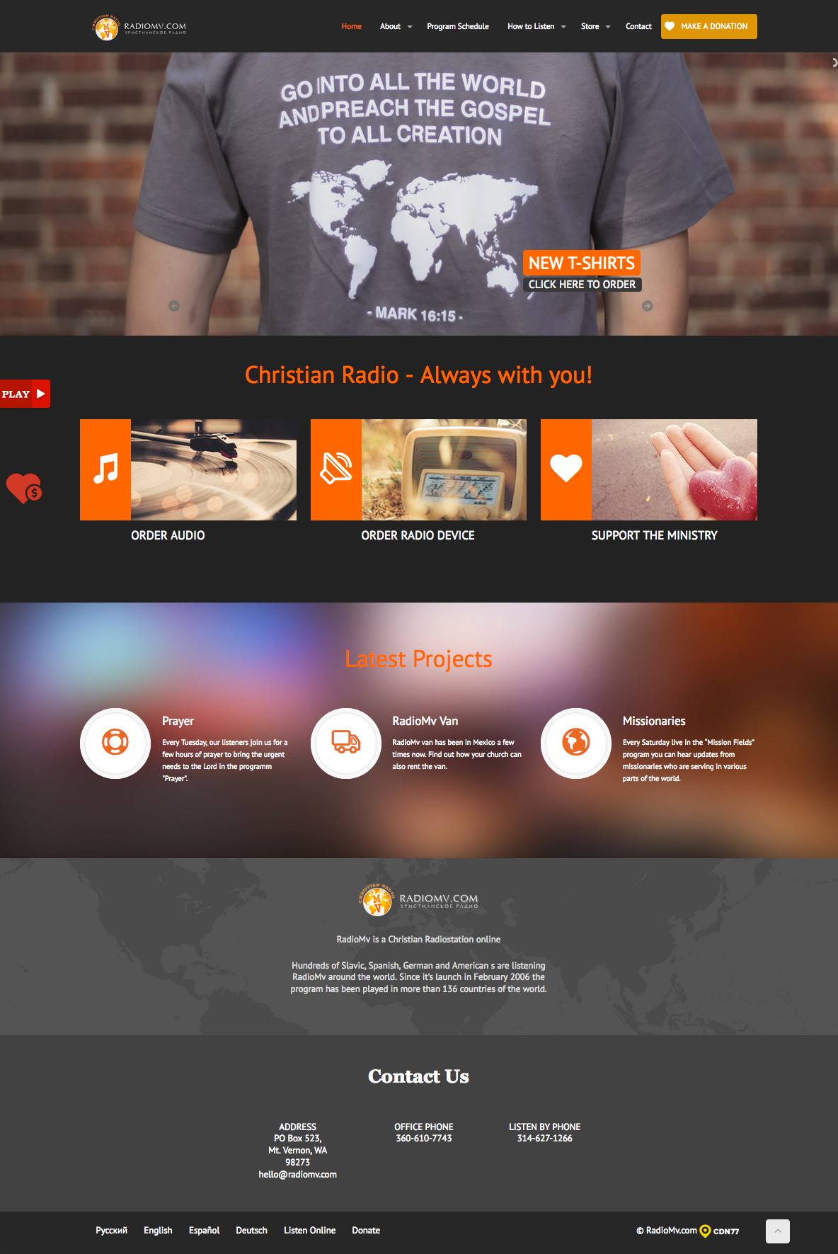
UI layout of RadioMv Home Page as of June 2015.
As a result of the redesign, the non-profit saw:
- Increased visits to the website
- Longer visit times
- More orders of free marketing material
- Less tech support calls regarding website
Click here to check out the radio station website. Please keep in mind some aspects of the design might have been altered or changed over the years.
Website design and development by © Alex Gaidai 2020